Navigating the Main Screen
The main screen is your home base: a resource list with All Files pinned first, a command bar that never runs out of room, tabs and optional panels that fit any screen width, and a filter and sort dialog that remembers your choice - with a corner pill to tell you when something is recording.
Why You'll Love This
The main screen is where every session with FastMediaSorter starts and usually ends. It is the one screen that has to make sense at a glance whether you have three resources or thirty - a folder on the phone, a shared drive at home, a handful of streams - so knowing what each part of it does saves you a few taps every single time you open the app.
Nothing here changes your files. This page is a map of the screen, not a set of actions to perform.
- FastMediaSorter in any edition: Standard, noLegal, Lite, Photos, Legacy, VR or FOSS. A couple of pieces described here - the streams panel and the paired-watch filter - only exist on editions that ship streams or a Wear OS companion.
- At least one resource added, so the list and the panels have something to show. See Setting up local and removable storage if you have not added one yet.
Read the resource list
Your resources - folders, network shares, cloud accounts, streams and anything else you have added - are shown as rows or tiles in the resource list. The All Files resource, where it exists on this edition, always stays first no matter how you sort the rest, unless a tab or a filter hides it entirely.
Long-press and drag any other resource to put it where you want it; the app remembers the new order. Tap View on the command bar to switch the whole list between rows (list view) and tiles (grid view).
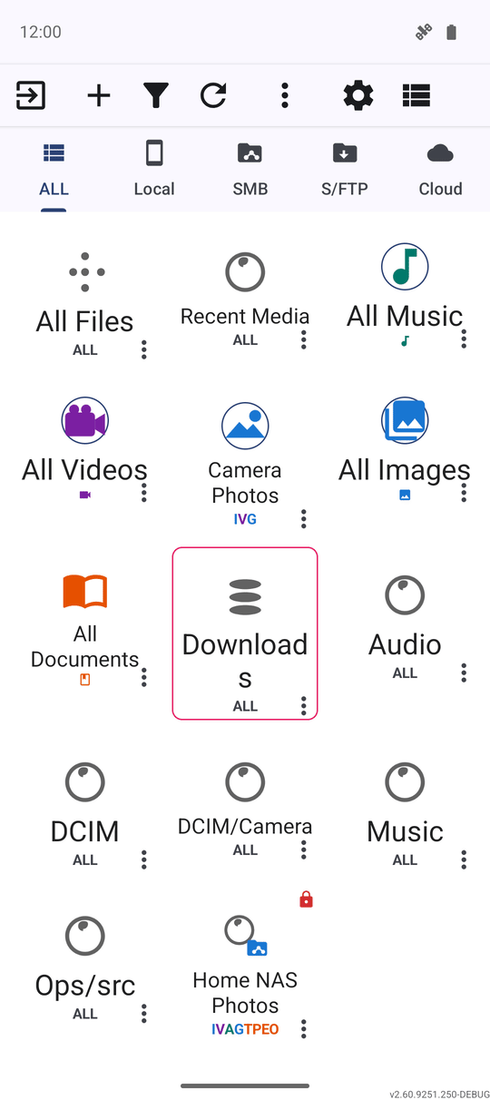
The command bar across the top
The row of buttons above the list - Exit, Add, Filter, Refresh, Settings, View, Favorites and Start Player - is always there, though not always with its text labels. On a narrow screen the labels disappear first so every icon still fits; if icons alone still do not fit, the buttons at the right give way one at a time into the More actions (three-dots) menu, so a command is never simply cut off the edge of the screen.
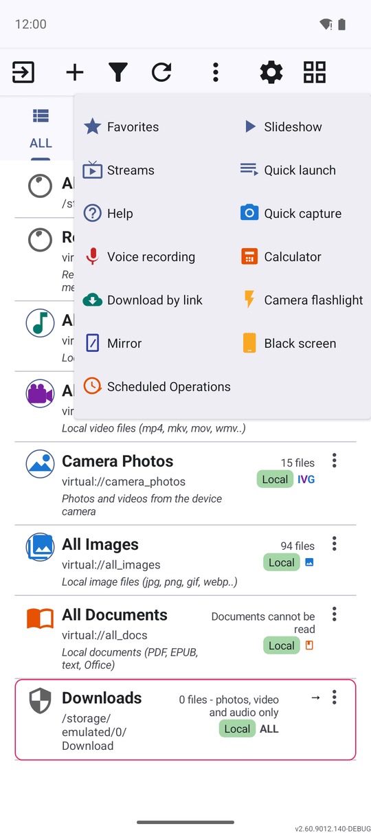
A command that moved into the three-dots menu works exactly the same as it did on the bar - it just needs one extra tap to find. Nothing you can do on a wide screen becomes unavailable on a narrow one.
Filter by type with the tabs
Just under the command bar sits a row of resource-type tabs - ALL and Local, plus SMB, S/FTP and Cloud on editions that have them - that narrow the resource list to one kind of resource with a single tap. Each tab takes a share of the available width rather than a fixed size, so every tab stays visible and tappable, Cloud included, in portrait, landscape and on the widest layouts.
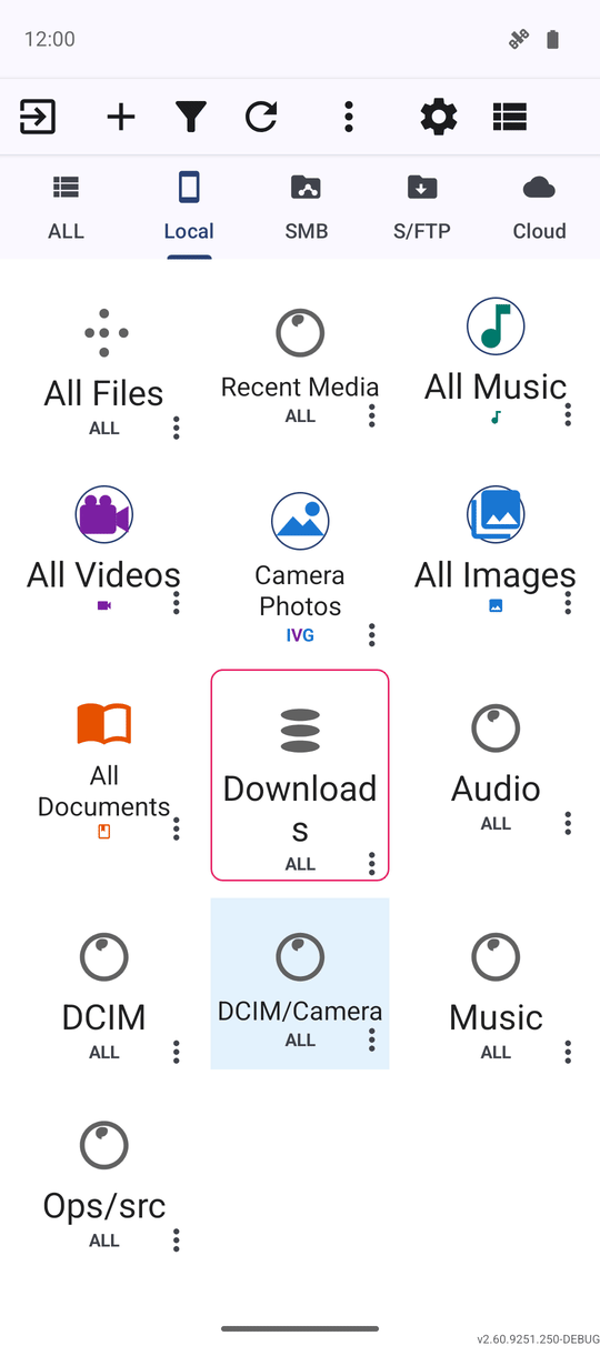
The programs and streams panels
Two optional bars can sit above the resource list: the programs panel for one-tap access to the app's built-in programs (see Built-in programs), and, on editions that ship streams, the streams panel for your pinned channels (see Browsing internet stream channels). Turn either on or off in Settings.
On a wide layout the two panels and the tab strip line up on one shared grid, using the programs panel's own button width as the common measure. If the screen is too narrow for a panel to show in full, its icon collapses into a small chip that moves into the free space at the end of the command bar row instead of taking a row of its own - unless the command bar is already full, in which case the chip keeps its own row.
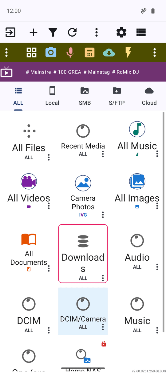
Sort and filter the resource list
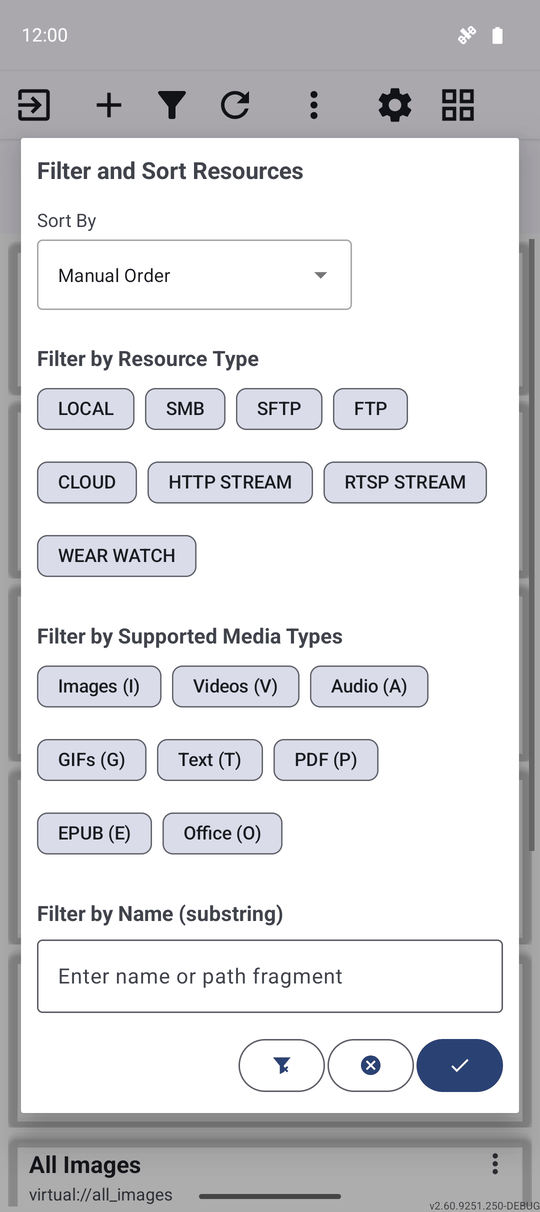
Tap Filter to open the Filter and Sort Resources dialog. From there you can filter by resource type, filter by the media types a resource supports, and choose a sort order. On Standard and noLegal you can also filter by a paired watch's own resource type.
Whatever you choose here is remembered and reapplied the next time you open the app - even after the app is force-stopped or the phone restarts - and a banner above the list reminds you which filters are currently on, so a short list reads as filtered rather than as resources gone missing. Full details: Sorting, filtering and quick search.
Prefer bigger or smaller tiles? Go to Settings, General, and set Resource grid cell size to Small, Medium or Large - it scales whatever column count your screen and orientation already use.
More on one resource - the three-dots menu
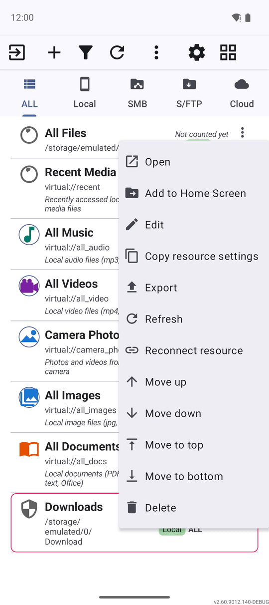
Open the three-dots menu on any resource row for the actions that do not fit as icons - renaming, removing, and Reconnect resource for a folder that needs its connection refreshed. If the folder you pick during a reconnect does not match what the resource pointed to before, a confirmation dialog asks you to double-check before it is applied - and that dialog now stays on screen if you rotate the phone while it is open, instead of quietly disappearing.
The recording indicator
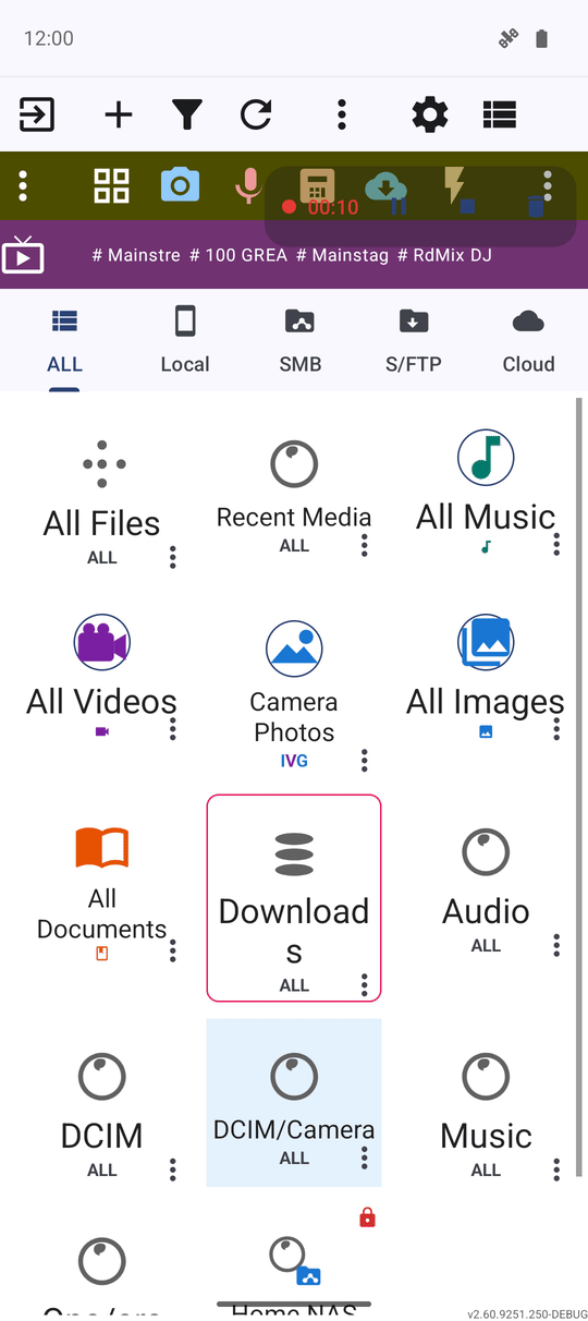
While a screen recording or a quick voice capture is running, a small pill appears in a corner of the screen - a dot, a timer, and pause/resume and stop buttons - so you can check on or stop the recording without leaving the main screen. It now shows up reliably on wide landscape layouts too, such as a car head unit, where it used to stay invisible. See Recording the device screen with audio.
What You Get
You can read the resource list at a glance, reach every command whether or not the screen has room for its label, narrow the list with the tabs and the filter dialog, tell at a glance when something is recording, and know where to look when a resource needs reconnecting.
Tips and Troubleshooting
- Built-in resources speak your language. Recent Media, All Music, All Files, Downloads and the other ready-made resources rename themselves the moment you switch the app's language, instead of staying in whatever language was active on first launch.
- A fresh install still shows real numbers. The file count on the built-in collections fills in shortly after install, in the background, instead of sitting at zero until you open each one.
- The Programs button stays centered. Its icon and label sit in the middle of their cell in both the regular and the compact command bar, so it lines up with its neighbors either way.