Home screen, navigation and most of Settings - both watch versions; the Permissions screen, color scheme and background synced from the phone - shown only where the build declares the matching access; the Original layout switch - the full watch version (sideload only)
Finding Your Way Around the Watch App - Home Screen, Look and Settings
A tour of the watch app's home screen - its sections, its recent and now-playing rows, Favorites - along with the clock, the back button, the first-run walk, and the Settings behind how it all looks.
Why You'll Love This
A watch screen is small enough that a single resource can take up half of it. FastMediaSorter's watch home screen keeps that in check: everything opens as a grid of shortcuts sorted into a handful of sections, with the things you opened last, and whatever is playing in the background, sitting right at the top.
This recipe is a tour of that home screen, the settings behind how it looks, and the small pieces - the clock, the back button, the first-run walk - that show up on every screen of the watch app.
- The watch app installed and paired with your phone - see installing and pairing the watch.
- For the Resources, Phone, Local and Streams sections, and for the Permissions entry in Settings: the full version of the watch app. *Sideload version only* - see the noLegal edition.
- A file, resource or channel marked as a favorite on the watch, to see the Favorites section filled in.
The home screen: sections, shortcuts and view modes
The watch app opens straight on this screen, no header taking up space above it. What you see is a grid - two or three icons per row, depending on your watch - built from a fixed set of sections, always in the same order: Resources, Phone, Local, Streams (only while it is switched on), Programs, and, at the very end, Favorites.
Switch between List, Grid 2 and Grid 3 from Settings, and the whole home screen - not just the file lists inside it - redraws itself to match. A cell with nothing in it stays blank rather than becoming a dead tap target, and on a single-column list the sections simply become an ordinary row of chips.
Every cell across the watch, home included, draws a plain rectangle: a thumbnail fills it edge to edge, and an item with no thumbnail shows a small icon inside a thin frame instead of a picture-less plate, in richer, more saturated colors than before, so a video shortcut and a document shortcut read apart at a glance. Lists open with the first item flush against the top of the round glass rather than centered under empty space, and a half-full last row of icons centers itself instead of hugging one edge. On the round screens, an empty section scrolls so its message and button stay reachable on the curved glass instead of being clipped by it.
Round watch, home screen, Grid 2 view mode, six sections visible with rectangular cells.
What's waiting at the top: recent shortcuts and what's playing
The row right under the top of the screen is not a section - it is a shortcut list of what you opened most recently: resources and the last stream channel you played, newest first, one cell per column. Open something again and it jumps back to the front instead of being listed twice; tap a shortcut to jump straight back in.
While something keeps going in the background - a track, a station - a second line names what is playing and offers Stop, or a tap to reopen the full player. Leave the home screen and come back, and it is still there for as long as playback continues.
Round watch, home screen top, three recent shortcuts and a now-playing line with a Stop button.
Favorites, always the last stop before Settings
Favorites is the one section guaranteed to be there, right before the Settings row at the bottom - a list of the files and channels you marked with the heart on the watch itself. Tap a row to open it in the matching player; each one also carries its own remove-from-favorites action.
Nothing marked yet? The section says so plainly: "Nothing marked yet. Tap the heart while playing a file." Marked something before the watch learned to remember how to reopen it? It is still listed, by its file name, and you can still take it off the list even though tapping it will not open it.
Round watch, Favorites section, three marked files listed with remove-from-favorites action.
Getting around: back, close and screen off
Every screen that is not the home screen itself carries a back arrow at the left edge, level with the middle of the display - a visible affordance alongside the system's own back swipe, so you are never guessing whether a screen has one. The home screen shows a close cross or a minimize-style double chevron in that same spot instead, depending on whether something is currently playing.
The home screen's own bottom row carries two more commands: Settings, and beside it Close app, which ends the watch app outright rather than leaving it running in the background - the next launch starts fresh at the home screen.
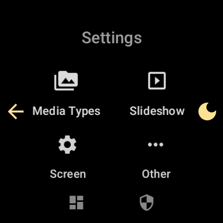
From nearly any screen, a moon-shaped Screen off button sits opposite the back arrow, at the right edge. Tap it and the display goes dark without stopping whatever it was doing; a single tap on the dark screen does not wake it - it sends a thin ring spreading out from where you touched and shows the current time and date above that spot for one second, so you can check the time and leave the watch dark. During that answer the screen is at full brightness; while dark it sits at the lowest, and it returns to its earlier brightness once you bring the screen back. To bring the screen back: double tap, press and hold, or use the watch's own button.
Round watch, a browse screen, back arrow left edge, moon Screen off button right edge.
Always on: the clock, the battery bar and keeping the screen awake
Every screen of the watch app draws a clock at the top, with a thin bar underneath it, the same width as the clock's own digits. The bar fills to match your battery charge and changes color as a plain warning: white while there is nothing to worry about, amber at 25% and below, red at 10% and below. The pair disappears only where the screen is meant to go dark on purpose, such as a player with its controls hidden.
Turn on Keep screen on - in Settings, or in Wear Companion on the phone - and the display stays awake everywhere, the startup splash and the first-run permission pages included, not only once you reach the home screen. Leaving a player for an ordinary screen no longer quietly drops the hold this setting is keeping open.
One more small courtesy: screens with their own list - Favorites, the health and motion screens, the network monitor, About - reopen exactly where you left them, instead of scrolling back to the top every time.
Round watch, top of screen, clock digits with a white battery bar beneath them.
First launch: the welcome page and the permission walk
The very first moment the watch app starts, before even the system splash finishes, a full-screen frame shows the real "Fast Media Sorter" wordmark under the app icon and the tagline "All mine, here!" - the system's own splash can only show a picture, never real text, so this frame carries the words. The icon on both surfaces is the same one you tapped to launch the app.
On a brand-new install, the next thing is a welcome page: the app icon, a short "Welcome" greeting, and the tagline "Your media companion on the wrist". From there, a build that has anything to ask for shows one page per group of access it needs - media files, microphone, notifications, heart rate, physical activity, nearby devices - each with its own reason and its own system prompt, and a "Step N of M" line above every one of them. Skip all ends the walk in one tap at any point; skip one group instead, and the feature it covers simply asks again the first time you open it. The Google Play version, which asks for none of this, shows only the welcome page.
Round watch, onboarding walk, Media files step, Step indicator, Allow and Skip chips, Skip all below.
Permissions, listed and explained any time
Settings carries its own Permissions entry, so you are never stuck guessing why a feature refuses to work. It lists every runtime permission this build can ask for:
- Media & Files - "Accessing media files for playback"
- Microphone - "Recording voice notes on watch"
- Sensors & Activity - "Reading heart rate and activity data"
Each row is marked Granted, or offered with a Grant button. Refused it for good already? The row opens the system's own App Info page instead, since the watch app can no longer ask directly.
The entry only appears in a build that actually declares one of these permissions - so on the Google Play version, which asks for none of them, Settings has no Permissions row at all, rather than an empty one.
Round watch, Settings, Permissions entry, three rows with reasons and grant states.
Settings, laid out to fit your wrist
Open Settings and every screen in it lays its controls out in rows of two or three wherever the display is wide enough - the same rule the file lists use for grid columns - so a short label sits two or three to a row while a longer one keeps the whole width to itself; nothing ever shrinks past a comfortable tap size. Every switch across these screens shares one look, and every icon target in the settings grid sits on a plain, see-through background rather than a filled button - a lighter, more watch-like plate than an ordinary settings list. Text across the watch app, settings included, is drawn from one consistent scale, so a setting label and, say, a reading on the athlete card come out at matching sizes.
Every set of buttons on the watch follows the same rule too: a menu or an action row - from a permission page's Allow and Skip to a settings action - centers itself and sizes to its content, each entry with its own icon, instead of stretching to fill the screen.
On a watch with a rotation sensor, Settings > Other carries an Auto rotation switch of the watch app's own. Turn it off and the screen stops turning with your wrist, without touching any system setting of the watch.
On the phone side, everything about the watch - the button that opens Wear Companion, its panel tile, its launcher shortcut - lives behind one master switch in a single collapsible Wear OS group on the Management tab; turn it off, and the whole companion disappears from the phone at once.
Colors and background, your way
In Settings, under Screen, Color scheme offers the same eight families the phone app does - Dark, Light, Dark green, Dark blue, Dark red, Light green, Light blue and Light red - applied to every screen at once, no restart needed. The accent hues match the phone's own, so a "blue" scheme reads as the same blue on both devices, while the surfaces underneath are tuned for the watch's own display. Dark is where every watch starts.
Right next to it, Watch Background sets what sits behind the lists: Branded animation (the moving waves), Branded still, Photo from phone, or Empty (black screen). A photo comes from the phone - see syncing the phone and the watch - and a picked one is dimmed automatically if it is too bright for the labels drawn over it; a dark photo or a branded background is left exactly as it was. Choosing Light also lightens that background layer and the veil drawn over a delivered photo, so text stays readable whichever background sits under it. The watch's own settings screens always stay on a plain background, whatever you choose for the rest of the app.
Both of these can also be set from the phone's Wear Companion window, and a change on either device reaches the other.
The FastMediaSorter Watch Face brings its own waves and drifting particles to the watch face itself. It is a separate, free watch face for Wear OS 6 and newer, with a large time, the date, battery bars and up to eight round buttons; install it from Google Play on the watch.
Round watch, Settings, Screen group, Color scheme list, eight options.
The layout from before the store review, if you'd rather have it
*Sideload version only.* Settings, under Screen, carries one more switch: Original layout. Turned on, it switches the watch app - every screen at once - back to the layout it had before its shapes were reviewed for the Play Store: content uses the full width of the display, and the round glass is allowed to cut the outer edge of things like the calculator's keys and the game board. That is the intended trade of this layout, not a fault in it. This build starts with Original layout on, and flipping it needs no restart.
Round watch, Settings, Screen group, Original layout row with summary text.
About: your web portal, two ways
About carries the app's version and build number, plus two links to the web portal - the same site this guide lives on. One opens the watch's own browser directly; the other, "Open on phone", hands the address to your paired phone instead, since not every watch has a browser worth using. Either way, the watch tells you what happened - opened, sent to the phone, or the message No browser on this watch. Use "Open on phone" if the first one has nowhere to go.
This whole watch guide - the one you are reading - lives on that same portal, in three languages, screenshots included; open it from About whenever you would rather read it on a bigger screen.
Round watch, About section, version and build lines, Web Portal and Open on phone entries.
The Google Play version and the full version
Two builds of the watch app exist. The Google Play version keeps to what the store allows: Calculator, Stopwatch, the mini-game, Settings and the Programs tile, starting on a plain black background, and it asks Android for no sensitive permission at all - no media, no microphone, no sensors. Everything this recipe covers beyond that - Resources, Phone, Local, Streams, Favorites, the Permissions entry - belongs to the full, sideload version. See the noLegal edition for how to get it.
One more small courtesy, on the phone side: wherever the app names your watch - its row in settings, a watch resource it creates, the sources list, a channel a watch broadcast adds - it uses the human name you gave the watch when you paired it, like "Galaxy Watch 6", never a bare model code.
What You Get
The watch home screen holds every section, your recent shortcuts and whatever is playing, all one glance and one tap away - and Settings, the colors, the background and the first-run walk all look and read the way you set them up.
Tips and Troubleshooting
- Every set of buttons on the watch sizes itself to what's on it. A menu or an action row centers itself and sizes to its content, each entry with its own icon, instead of stretching to fill the screen.
- Nothing to tap in an empty cell. A missing shortcut leaves its cell blank rather than turning it into a dead tap target - don't worry if a row looks shorter than expected.
- Changed your mind about a permission? Open the feature that needs it and the watch simply asks again - nothing is locked in by skipping it once.
- Want the colors and background set up without touching the watch? Do it from the phone - see syncing the phone and the watch.
- Looking for what's inside Programs? See wrist programs and tools.